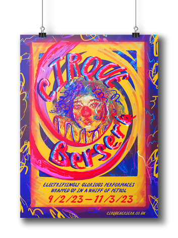
striking, bizarre,unique
Cirque Berserk is no ordinary circus, combining contemporary cirque-style artistry with adrenaline-fuelled stunt action. I wanted the imagery to hypnotize viewers and pull them in. To achieve this, I used procreate to draw a chilling yet whimsical clown in the center of a warped Fraser's spiral illusion. I used neon colors to mirror theatrical lights and created a topsy-turvy font to emulate the nonsensical essence of the show.

intricate, informational, techincal
This poster is designed to be a teaching aid for young design students. It highlights the typographic mechanics of the Rockwell font and shows alternative ways to utilize typography. Using adobe illustrator, I created geometric lines to showcase the blocky sharp nature of the infamous font, while also outlining the history of its making. I kept the color pallet simple and light so the bright yellow title would stand out and the portrait of Rockwell would shine.

inviting, warm, charming
I wanted this speed dating poster to stand out from the generic valentines aesthetic while still capturing the feeling of love and romance. I decided to emulate the energy of valentines day by creating an intimate hand-drawn illustration using procreate. I wanted it to feel organic and sweet.

empowering, bold, iconic
I used Adobe illustrator to create my take on the classic Rosy the Riveter poster. I used the same color pallet as the original iconic poster but opted for a more graphic vectorized illustration style. This makes the image easier to reproduce in different contexts, such as pins, t-shirts, handouts, and so on. This message is important for all audiences, so I wanted to make my design accessible and easy to digest.

eye catching,shocking, daring
This poster was made for the opening of a feminist poetry slam event. The goal of this poster isn't to inform but to elicit an emotional response. I photographed the model with a bird's eye view and high-contrast lighting. I layered the photo and warped the font to create a disorienting motion blur. I choose to keep the color pallet limited to red so it would stand out and evoke anger. It's designed to catch the eye of viewers and entice them to learn more and draw them into the event.


